Visualization (Advanced)
In the YDS Library there are also some advanced versions of the visualization components, which include more advanced functions for filtering the displayed data by specific countries and years. Using the combobox attributes of these components, multiple comboboxes can be specified for selecting years and countries (such as destination, origin etc.). The comboboxes will appear over the chart. The attribute names that you will define have to be supported by the API for the view type that you are using.
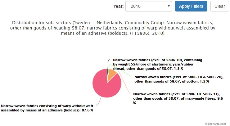
1. Advanced Pie Component:
The Advanced Pie component is also based on the Highcharts library, however it is extended in order to support selecting countries and years.
Example Usage:
<yds-pie-advanced
    project-id="http://linkedeconomy.org/resource/TradeActivity/SE/NL/2011/11580610"
    view-type="tradeactivity.broader.commodity_group.per.sub_sector"
    show-legend="false"
    exporting="false"
    combobox="year"
    combobox-labels="Year"
    combobox-attrs="year">
</yds-pie-advanced>
Input Values:
| Input | Description |
|---|---|
| project-id (required) | String attribute, which defines the unique identifier of the resource that the displayed data is associated with. If empty, the element cannot be initialized. |
| view-type | String attribute that defines the declarative name of the table which contains the data to be rendered. Default value is "default". |
| lang | Language of the visualised data |
| show-legend | Boolean attribute, which enables or disables the chart legend |
| exporting | Enable or disable exporting of the chart (Default: true) |
| element-h | Height of the component, in pixels |
| title-size | Numeric attribute, which defines the size of the chart's title (Default: 18) |
| combobox | String attribute, which is used to set the type of the combobox filters ("year" or "country"). It can be a single type, or a list of types separated by commas, for example: year,year,country |
| combobox-labels | String attribute, which sets the labels that will be used for each filter. For multiple labels, separate them with commas. |
| combobox-attrs | String attribute, which sets the names of the parameters that each combobox will use to send its value to the server. For multiple comboboxes, separate the attribute names with commas. |
Screenshot:
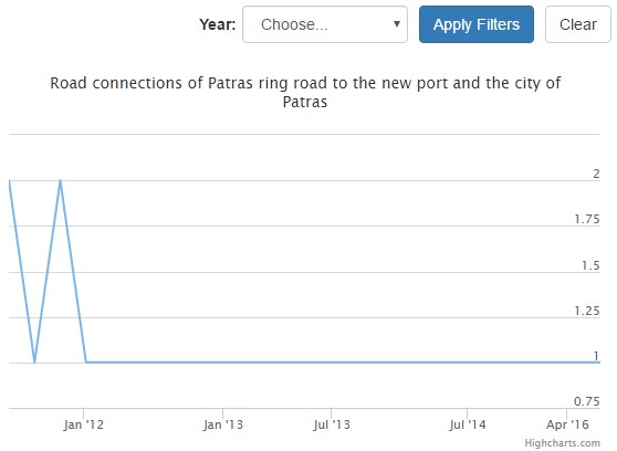
2. Advanced Line Component:
The Advanced Line component is also based on the Highstock visualization library, like the Line component. It adds support for comboboxes for country and year filtering of the data.
Example Usage:
<yds-line-advanced
    project-id="http://linkedeconomy.org/resource/PublicWork/292681"
    view-type="project.decisions.financial.decisions.over.date"
    show-navigator="false"
    exporting="false"
    title-size="14"
    combobox="year"
    combobox-labels="Year"
    combobox-attrs="year">
</yds-line-advanced>
Input Values:
| Input | Description |
|---|---|
| project-id (required) | String attribute, which defines the unique identifier of the resource that the displayed data is associated with. If empty, the element cannot be initialized. |
| view-type | String attribute that defines the declarative name of the table which contains the data to be rendered. Default value is "default". |
| lang | Language of the visualised data |
| show-navigator | Boolean attribute, which defines if the line component will show the navigator below the main chart Default: true |
| exporting | Enable or disable exporting of the chart (Default: true) |
| element-h | Height of the component, in pixels |
| title-size | Numeric attribute, which defines the size of the chart's title (Default: 18) |
| combobox | String attribute, which is used to set the type of the combobox filters ("year" or "country"). It can be a single type, or a list of types separated by commas, for example: year,year,country |
| combobox-labels | String attribute, which sets the labels that will be used for each filter. For multiple labels, separate them with commas. |
| combobox-attrs | String attribute, which sets the names of the parameters that each combobox will use to send its value to the server. For multiple comboboxes, separate the attribute names with commas. |
Screenshot:
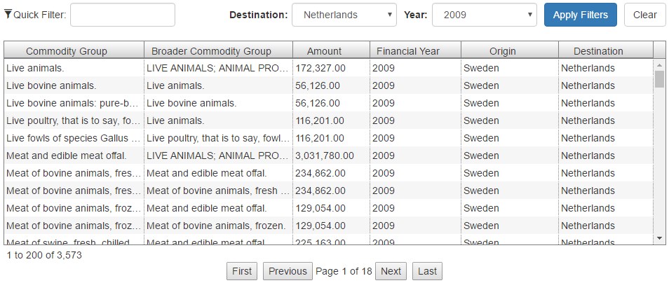
3. Advanced Grid Component:
The Advanced Grid component is based on the ag-Grid library. It supports comboboxes for year and country selection. An important difference between this component and the simpler Grid component is that Advanced Grids always use pagination (with a customizable page size). Also column resizing, filtering and sorting are always enabled.
Example Usage:
<yds-grid-advanced
    project-id="http://linkedeconomy.org/resource/TradeActivity/SE/NL/2011/11580610"
    view-type="tradeactivity.exports.for.destination"
    combobox="year,country"
    combobox-labels="Year,Destination"
    combobox-attrs="year,destination">
</yds-grid-advanced>
Input Values:
| Input | Description |
|---|---|
| project-id (required) | String attribute, which defines the unique identifier of the resource that the displayed data is associated with. If empty, the element cannot be initialized. |
| view-type | String attribute that defines the declarative name of the table which contains the data to be rendered. Default value is "default". |
| lang | Language of the visualised data |
| element-h | Height of the component, in pixels |
| page-size | Numeric attribute that defines the rows per page of the paginated grid display. Available options: 0-10000 Default: 100 |
| combobox | String attribute, which is used to set the type of the combobox filters ("year" or "country"). It can be a single type, or a list of types separated by commas, for example: year,year,country |
| combobox-labels | String attribute, which sets the labels that will be used for each filter. For multiple labels, separate them with commas. |
| combobox-attrs | String attribute, which sets the names of the parameters that each combobox will use to send its value to the server. For multiple comboboxes, separate the attribute names with commas. |
| add-to-basket | Boolean attribute, which enables or disables the "Add to Basket" functionality. |
| embeddable | Boolean attribute, which defines if the component can be embedded or not. Available options: true, false Default: false |
| popover-pos | Attribute which defines from which side of the embed button, the embed information window will appear. Available options: right, left, top, bottom Default: right |
| disable-explanation | Disable the chart query explanation button for this component. |
Screenshot: