Tabbed Search
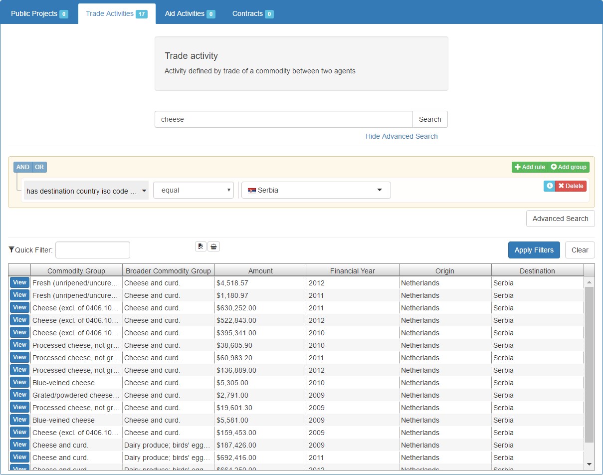
The Tabbed Search is a way to view and search the data of the YDS Platform in a different way. Instead of searching with just a search keyword and limiting the results to specific concepts, in Tabbed Search the user selects a concept from the ones that are available in order to view all the results available in it. They can search within that concept by using keywords and the Advanced Search, which is a way to create more complex queries with a graphical user interface. In the Advanced Search, multiple plugins are available to make the input of values easier for the user.
1. Search Tabs Component:
The 'Search Tabs' component combines all the components required for the tabbed search interface into one simple to use component:
- Basic Search component (search bar)
- Query Builder component (for advanced search)
- Concept Description component
- Grid Results component
When the component loads, it gets the available Search concepts from the API, then it creates tabs for each concept, which contain a search box with optional advanced filters, and a grid with the results. All the individual components and their functions are explained below.
Example Usage:
<yds-search-tabs
    lang="en">
</yds-search-tabs>
Input Values:
| Input | Description |
|---|---|
| lang | Language of the tabbed search interface. |
| default-tab | String attribute, which defines the concept of the tab that should be selected when the search interface loads. If not set, the first tab will be selected. |
| hide-tabs | Boolean attribute, used to hide the tabs of the tabbed search interface. Can be useful if you want to show the tabbed search interface only for a single concept (that you can select via the default-tab attribute). |
| url-param-prefix | String attribute, defines a prefix to add to all URL parameters that the search interface will use. Useful when using multiple <yds-search-tabs> to show different concepts at the same time in the same page. |
| add-to-basket | Boolean attribute, which defines if the "Add to Basket" button should be shown on the search results. |
| enable-adv-search | Boolean attribute, which enables or disables advanced search. |
Screenshot:

2. Basic Search Component:
The Basic Search component is explained in the previous page, however in the tabs of Tabbed Search it is initialized a little differently in order to show the Advanced Search options. In the Example Usage below you can see how the Search Tabs component initializes the Basic Search for the "Trade Activities" tab.
Example Usage:
<yds-search
    tabbed="true"
    lang="en"
    max-suggestions="15"
    concept="TradeActivity"
    concept-id="http://linkedeconomy.org/ontology#TradeActivity">
</yds-search>
Screenshot:

3. Query Builder Component:
This component allows the user to create complex queries for search the data in the YDS Platform in an easy to understand way, with a graphical user interface. It is based on jQuery QueryBuilder, extending it in order to have submenus for filter selection using Selectivity.js. Included in the YDS Library are also some plugins used by the QueryBuilder in filters where they are applicable:
- YDS Country Selector: Allows the selection of countries from a list which includes flags, instead of typing the country name.
- YDS Currency Selector: Allows the selection of currencies from a list.
- YDS Map Selector: Allows the selection of a point on the map.
- YDS Year Selector: Allows the selection of years with a graphical user interface.
In fields where there is text input, suggestions are shown that are tailored to that specific field. In the Example Usage you can see how the Query Builder component is initialized for the "Trade Activities" tab.
Example Usage:
<query-builder
    lang="en"
    concept="TradeActivity"
    concept-id="http://linkedeconomy.org/ontology#TradeActivity"
    max-suggestions="10">
</query-builder>
Input Values:
| Input | Description |
|---|---|
| lang | Language of the component's interface. |
| max-suggestions | Maximum amount of suggestions to show in the suggestions dropdowns. |
| concept-id | String attribute, which defines the ID of the concept that the Query Builder should use to get the available filters from the API. |
| concept | String attribute, which defines the name of the concept that the Query Builder will get rules for. |
| url-param-prefix | String attribute, defines a prefix to add to all URL parameters that the Query Builder will use. Default is to use no prefix at all. |
| watch-rule-url-param | Boolean attribute, which defines if the Query Builder should watch the "rules" URL parameter for changes, and update the displayed rules in the Query Builder's interface. In the Tabbed Search page this is not needed. (Default: false) |
Screenshot:

4. Concept Description Component:
The Concept Description component is a simple component used in the Tabbed Search interface to provide an easy to understand description for each concept of the data that the user can search. It displays the concept name and description.
Example Usage:
<yds-concept-description
    concept-id="http://linkedeconomy.org/ontology#TradeActivity"
    lang="en">
</yds-concept-description>
Input Values:
| Input | Description |
|---|---|
| lang | Language of the displayed description. |
| concept-id | String attribute, which defines the ID of the concept that the displayed description should be about. |
Screenshot:

5. Grid Results Component
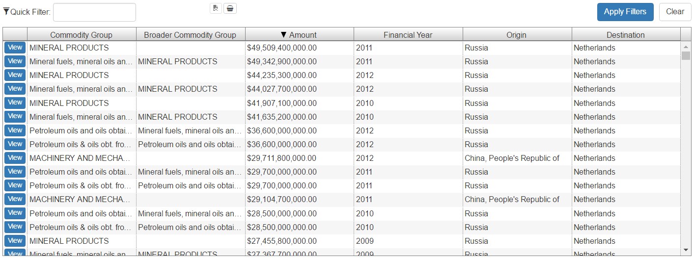
The Grid Results component is based on ag-Grid and shows results in a grid format. It supports infinite scrolling and server-side sorting on the columns that the server allows it. In Tabbed Search it displays the search results, however it can also be used standalone. On every result, there is a "View" button, which will show more information about the result. The component also supports exporting up to 5.000 results to a CSV file.
Example Usage:
<yds-grid-results
    project-id="none"
    view-type="TradeActivity"
    sorting="true"
    lang="en"
    quick-filtering="true"
    col-resize="true"
    page-size="50"
    add-to-basket="true"
    exporting="true">
</yds-grid-results>
Input Values:
| Input | Description |
|---|---|
| project-id | String attribute, which defines the unique identifier of the resource that the displayed data is associated with. (Default: "none") |
| view-type (required) | String attribute that defines the declarative name of the table which contains the data to be rendered. |
| lang | Language of the displayed results |
| url-param-prefix | String attribute, defines a prefix to add to all URL parameters that the component will use. Default is to use no prefix at all. |
| use-grid-api | Normally, the Grid Results component uses the Search API. Set this to true to make it use the Grid API instead. This can be used if you want to simply show some data that is normally shown by the Grid component, but you also want the "View" button of Grid Results to give the option to show more information about the displayed results. (Default: false) |
| timeseries | If you are using the grid API (see above), set this to true to show data per year instead of aggregated. |
| number-of-items | If you are using the grid API (see above) but want to use virtual paging, set this parameter to the total number of items. |
| sorting | Boolean attribute, which enables or disables server-side sorting of the data. When enabled, sorting is only allowed in columns that the server allows it. |
| quick-filtering | Boolean attribute, which enables or disables quick filtering. Quick filtering for this component is done server-side. (Default: false) |
| col-resize | Boolean attribute, which defines if the grid will allow the user to resize the columns. (Default: false) |
| page-size | Numeric attribute that defines the number of rows that the grid will load with each request to the server when the user scrolls and more rows have to be loaded with infinite scrolling. |
| element-h | Height of the component, in pixels |
| show-results-num | Boolean attribute, which defines if the component will show the number of loaded and total results on the page. (Default: false) |
| enable-view-button | Enable or disable making the first column's content a link to view more details (Default: true) |
| project-details-type | Type to use for viewing details when clicking the link in the first column. If not defined, will use the view-type, which may or may not work. |
| exporting | Boolean attribute, which enables exporting the grid's results to a CSV file (Default: false) |
| popover-pos | Attribute which defines from which side of the embed button the popover will appear. Available options: right, left, top, bottom. Default: right. |
| add-to-basket | Boolean attribute, which enables or disables the "Add to Basket" functionality |
| embeddable | Boolean attribute, which defines if the map component can be embedded or not. Available options: true, false Default: false |
| popover-pos | Attribute which defines from which side of the embed button, the embed information window will appear. Available options: right, left, top, bottom Default: right |
| extra-params | Object with extra parameters to send in the request to the API. |
| enable-rating | Enable rating buttons for this component. |
| disable-explanation | Disable the chart query explanation button for this component. |
Screenshot:
