Visualization
The YDS Library includes a number of visualization components ranging from map, line and bar charts to pie and grid widgets. In the following paragraphs, we present thoroughly each component along with the available customization options.
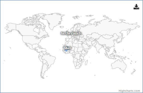
1. Heat Map Component:
The 'Heat Map' component is based on the Highmaps visualization library. It is a map component which allows users to depict countries with different colors depending on the data provided for each country. The developers are able to define the range of countries or continents shown inside the map as well as the color range which will be used throughout the map.
Example Usage:
<yds-heatmap
    project-id="http://linkedeconomy.org/resource/AidActivity/NL-1-PPR-25961">
</yds-heatmap>
Input Values:
| Input | Description |
|---|---|
| project-id (required) | String attribute, which defines the unique identifier of the resource that the displayed data is associated with. |
| view-type | String attribute that defines the declarative name of the table which contains the data to be rendered. Default value is "default". |
| lang | Language of the visualised data (on the heat map's labels). |
| extra-params | Object with extra parameters to send in the request to the API. |
| color-axis | Enable or disable the colored axis of the chart. (Default: false) |
| color-type | Specifies if the color axis should be "linear" or "logarithmic". (Default: linear) |
| legend | Enable or disable the heat map legend. (Default: false) |
| legend-title | Title for the legend. |
| legend-v-align | Specifies how to vertically align the chart legend. Can be top, middle or bottom (Default: top) |
| legend-h-align | Specifies how to horizontally align the chart legend. Can be left, center or right (Default: center) |
| legend-layout | Specifies if the legend should be vertical or horizontal (Default: horizontal) |
| europe-only | Set to true to display only Europe on the heatmap instead of the world map (Default: false) |
| base-url | Base URL to send to the API, so links can be created in the component contents. Required for some view types (the API will return an error indicating it). |
| exporting | Enable or disable exporting of the heat map. (Default: true) |
| no-border | If true, the heat map will not display a border around it like it does by default. |
| element-h | Height of the heat map, in pixels. |
Screenshot:
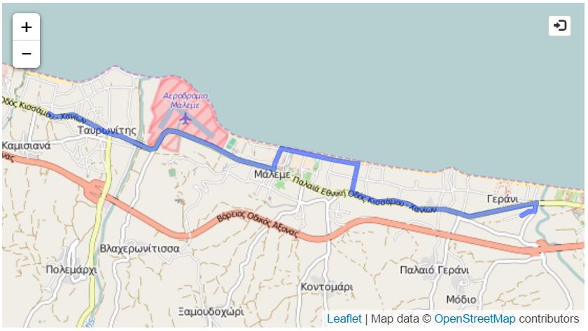
2. Map Component:
The 'Map' component is based on the Leaflet JavaScript library , an open-source library for mobile-friendly interactive maps. It is a map component which can be used in order to display a specific route on a map. The displayed route is being retrieved through a REST API by declaring its unique identifier in the corresponding attribute of the component. The user is able to zoom to a specific portion of the map as well as to navigate to other locations. Moreover, the map component allows users to embed it on their own websites using an iframe element.
Example Usage:
<yds-map
    project-id="http://linkedeconomy.org/resource/Subsidy/519339"
    lang="en"
    embeddable="true"
    popover-pos="left">
</yds-map>
Input Values:
| Input | Description |
|---|---|
| project-id (required) | String attribute, which defines the unique identifier of the resource that the displayed route is associated with. If empty, the element cannot be initialized. |
| view-type | String attribute that defines the declarative name of the table which contains the data to be rendered. Default value is "default". |
| lang | Language of the visualised data. |
| disable-clustering | Boolean attribute, which enables or disables point clustering on the map. |
| max-cluster-radius | Maximum radius that a cluster will cover from the central marker, in pixels. |
| mouse-over-markers | Boolean attribute, that will make point markers appear on mouse over instead of click if true. |
| add-to-basket | Boolean attribute, which enables or disables the "Add to Basket" functionality. |
| embeddable | Boolean attribute, which defines if the map component can be embedded or not. Available options: true, false Default: false |
| popover-pos | Attribute which defines from which side of the embed button, the embed information window will appear. Available options: right, left, top, bottom Default: right |
| extra-params | Object with extra parameters to send in the request to the API. |
| zoom-control | Boolean attribute, which enables or disables the map's zoom control. |
| element-h | Height of the heat map, in pixels. |
| enable-rating | Enable rating buttons for this component. |
| disable-explanation | Disable the chart query explanation button for this component. |
Screenshot:
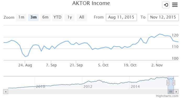
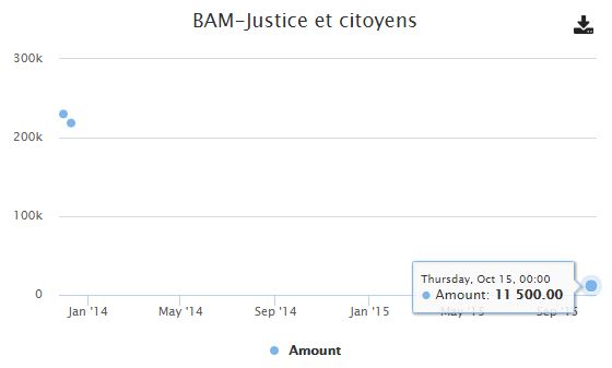
3. Line Chart Component:
The 'Line Chart' component is based on the Highstock visualization library. It consists of a 2D plot of time - series data. The library can zoom into predefined time periods, or into custom time periods by means of the two date boxes on the top right corner. The zoom can also be altered graphically, by dragging the bottom right navigation bar left or right. The plot may be persisted using the two different buttons on the top right corner. On the right side, there is the ‘extract’ button, which provides the option to extract the plot in various image formats, or print the plot directly. On the left of this button is the ‘embed’ button, which provides embedding functionality of the component.
Example Usage:
<yds-line
    project-id="http://linkedeconomy.org/resource/AidActivity/NL-1-PPR-25961"
    view-type="aidactivity.transactions.amount.over.date"
    lang="en"
    element-h="350"
    show-navigator="false"
    add-to-basket="true">
</yds-line>
Input Values:
| Input | Description |
|---|---|
| project-id (required) | String attribute, which defines the unique identifier of the resource that the displayed data is associated with. If empty, the element cannot be initialized. |
| view-type | String attribute that defines the declarative name of the table which contains the data to be rendered. Default value is "default". |
| lang | Language of the visualised data. |
| extra-params | Object with extra parameters to send in the request to the API. |
| timeseries | Boolean attribute, set to true to show data per year instead of aggregated. |
| exporting | Enable or disable exporting of the chart. (Default: true) |
| element-h | Height of the component, in pixels. |
| title-size | Numeric attribute, which defines the size of the chart's title. (Default: 18) |
| add-to-basket | Boolean attribute, which enables or disables the "Add to Basket" functionality. |
| embeddable | Boolean attribute, which defines if the component can be embedded or not. Available options: true, false Default: false |
| popover-pos | Attribute which defines from which side of the embed button, the embed information window will appear. Available options: right, left, top, bottom Default: right |
| enable-rating | Enable rating buttons for this component. |
| disable-explanation | Disable the chart query explanation button for this component. |
Screenshot:
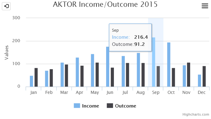
4. Bar Chart Component:
The 'Bar Chart' component is based on the Highcharts library. It is a highly customizable chart library with the following features:
- HTML formatted title and subtitle
- HTML formatted tooltip
- Customizable padding and width
- Customizable colors on each bar group
- Directly printable document via a menu selection
- Directly exportable document as an image via a menu selection
The library is extended in the context of the YDS platform to support embed functionality, via a menu selection.
Example Usage:
<yds-bar
    project-id="none"
    view-type="aidactivity.benefactor.countries.all"
    add-to-basket="true"
    embeddable="true"
    element-h="460">
</yds-bar>
Input Values:
| Input | Description |
|---|---|
| project-id (required) | String attribute, which defines the unique identifier of the resource that the displayed route is associated with. If empty, the element cannot be initialized. |
| view-type | String attribute that defines the declarative name of the table which contains the data to be rendered. Default value is "default". |
| lang | Language of the visualised data. |
| extra-params | Object with extra parameters to send in the request to the API. |
| enable-paging | Enable paging for the component. (Default: false) |
| page-size | Page size for paging. |
| number-of-items | Number of items, required to know for paging. |
| exporting | Enable or disable exporting of the chart. (Default: true) |
| element-h | Height of the component, in pixels. |
| title-size | Numeric attribute, which defines the size of the chart's title. (Default: 18) |
| add-to-basket | Boolean attribute, which enables or disables the "Add to Basket" functionality. |
| embeddable | Boolean attribute, which defines if the map component can be embedded or not. Available options: true, false Default: false |
| popover-pos | Attribute which defines from which side of the embed button, the embed information window will appear. Available options: right, left, top, bottom Default: right |
| enable-rating | Enable rating buttons for this component. |
| disable-explanation | Disable the chart query explanation button for this component. |
Screenshot:
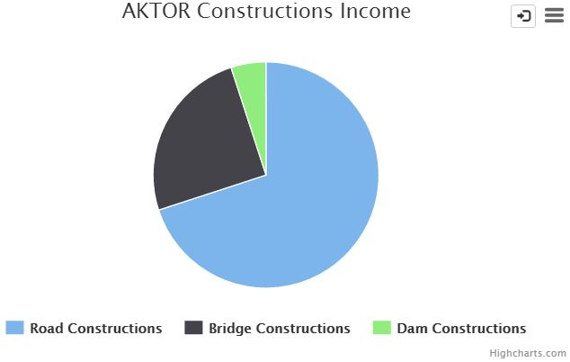
5. Pie Chart Component:
The 'Pie Chart' component is based on the Highcharts JavaScript library, a library for creating pie plots for visualizing data. A pie chart is a circular chart divided into sectors which is proportional to the quantity it represents. The library comes with a handful of visualization features, such as:
- Configuration of colors, margins, paddings of the plot
- Ability to easily render plots from large datasets, with a highly configurable API
- HTML configurable title and tooltip
The component is extended in the context of the YDS platform to support embed functionality.
Example Usage:
<yds-pie
    project-id="http://linkedeconomy.org/resource/AidActivity/NL-1-PPR-28181"
    view-type="aidactivity.activity.per.sector"
    show-legend="true"
    embeddable="false"
    add-to-basket="false">
</yds-pie>
Input Values:
| Input | Description |
|---|---|
| project-id (required) | String attribute, which defines the unique identifier of the resource that the displayed data is associated with. If empty, the element cannot be initialized. |
| view-type | String attribute that defines the declarative name of the table which contains the data to be rendered. Default value is "default". |
| lang | Language of the visualised data. |
| extra-params | Object with extra parameters to send in the request to the API. |
| exporting | Enable or disable exporting of the chart. (Default: true) |
| element-h | Height of the component, in pixels. |
| title-size | Numeric attribute, which defines the size of the chart's title (Default: 18) |
| add-to-basket | Boolean attribute, which enables or disables the "Add to Basket" functionality. |
| embeddable | Boolean attribute, which defines if the component can be embedded or not. Available options: true, false Default: false |
| popover-pos | Attribute which defines from which side of the embed button, the embed information window will appear. Available options: right, left, top, bottom Default: right |
| enable-rating | Enable rating buttons for this component. |
| disable-explanation | Disable the chart query explanation button for this component. |
Screenshot:
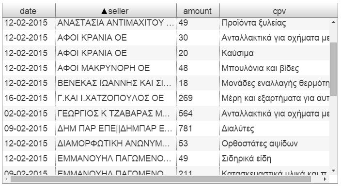
6. Grid Component:
The 'Grid' component is based on the ag-Grid JavaScript library , a powerful library for creating data grids with large volumes of data. Users are able to navigate with ease through the displayed data by using its pagination features. They can also sort the displayed data (ascending/descending) based on a specific column of the table by clicking on the header of the corresponding column. Moreover, users have the ability to reorder and resize the columns of the grid according to their needs.
Example Usage:
<yds-grid
    project-id="http://linkedeconomy.org/resource/AidActivity/NL-1-PPR-25961"
    view-type="aidactivity.aidactivities.between.countries"
    sorting="true"
    lang="en"
    filtering="true"
    quick-filtering="true"
    col-resize="true"
    paging="false">
</yds-grid>
Input Values:
| Input | Description |
|---|---|
| project-id (required) | String attribute, which defines the unique identifier of the resource that the displayed data is associated with. If empty, the element cannot be initialized. |
| view-type | String attribute that defines the declarative name of the table which contains the data to be rendered. Default value is "default". |
| lang | Language of the visualised data. |
| extra-params | Object with extra parameters to send in the request to the API. |
| base-url | Base URL to send to the API, so links can be created. Required for some view types (the API will return an error indicating it). |
| sorting | Boolean attribute, which defines if the columns of the grid will allow content sorting on click. Available options: true, false Default: false |
| filtering | Boolean attribute, which defines if the columns of the grid will allow filtering the results. (Default: false) |
| quick-filtering | Boolean attribute, which enables or disables filtering the grid's results by specific keywords via a text field. |
| col-resize | Boolean attribute, which defines if the grid will allow the user to resize the columns. |
| element-h | Height of the component, in pixels. |
| grouped-data | For some view-types (e.g. "contract.comparison.CPVs.for.countries.and.period"), the data returned from the API is grouped. In these cases, set this value to true (Default: false) |
| timeseries | Boolean attribute, set to true to show data per year instead of aggregated. |
| add-to-basket | Boolean attribute, which enables or disables the "Add to Basket" functionality. |
| exporting | Boolean attribute, which enables exporting the grid's results to a CSV file (Default: false) |
| embeddable | Boolean attribute, which defines if the map component can be embedded or not. Available options: true, false Default: false |
| popover-pos | Attribute which defines from which side of the embed button, the embed information window will appear. Available options: right, left, top, bottom Default: right |
| fit-columns | Boolean attribute, which defines if the grid will fit the columns to the grid width after loading. |
| enable-rating | Enable rating buttons for this component. |
| disable-explanation | Disable the chart query explanation button for this component. |
Screenshot:
7. Scatter Chart Component:
The scatter chart component is based on the Highcharts visualization library. It works in a similar way to the line chart component, but instead of displaying the data as a line, it is shown as individual points.
Example Usage:
<yds-scatter
    project-id="http://linkedeconomy.org/resource/AidActivity/NL-1-PPR-25961"
    view-type="aidactivity.transactions.amount.over.date"
    lang="en"
    element-h="350"
    show-navigator="false">
</yds-scatter>
Input Values:
| Input | Description |
|---|---|
| project-id (required) | String attribute, which defines the unique identifier of the resource that the displayed data is associated with. If empty, the element cannot be initialized. |
| view-type | String attribute that defines the declarative name of the table which contains the data to be rendered. Default value is "default". |
| lang | Language of the visualised data |
| exporting | Enable or disable exporting of the chart (Default: true) |
| element-h | Height of the component, in pixels |
| title-size | Numeric attribute, which defines the size of the chart's title (Default: 18) |
| add-to-basket | Boolean attribute, which enables or disables the "Add to Basket" functionality |
| embeddable | Boolean attribute, which defines if the component can be embedded or not. Available options: true, false Default: false |
| popover-pos | Attribute which defines from which side of the embed button, the embed information window will appear. Available options: right, left, top, bottom Default: right |
| enable-rating | Enable rating buttons for this component |
| disable-explanation | Disable the chart query explanation button for this component. |
Screenshot:
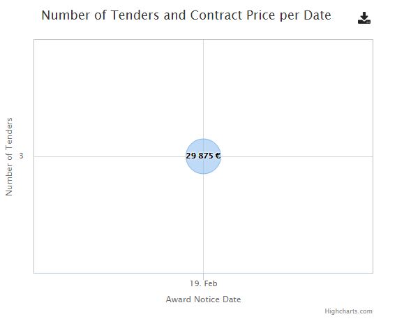
8. Bubble Chart Component:
The Bubble Chart component is based on the Highcharts visualization library. It shows a type of chart that can display data with 3 dimensions via each data point's x, y axis positions and its size.
Example Usage:
<yds-bubble
    project-id="http://linkedeconomy.org/resource/Contract/AwardNotice/6723325"
    view-type="contract.listitems.for.buyer.and.seller"
    element-h="450"
    lang="en">
</yds-bubble>
Input Values:
| Input | Description |
|---|---|
| project-id (required) | String attribute, which defines the unique identifier of the resource that the displayed data is associated with. If empty, the element cannot be initialized. |
| view-type | String attribute that defines the declarative name of the table which contains the data to be rendered. Default value is "default". |
| lang | Language of the visualised data |
| extra-params | Object with extra parameters to send in the request to the API |
| base-url | Base URL to send to the API, so links can be created for the bubbles. Required for some view types (the API will return an error indicating it). |
| exporting | Enable or disable exporting of the chart (Default: true) |
| element-h | Height of the component, in pixels |
| title-size | Numeric attribute, which defines the size of the chart's title (Default: 18) |
| subtitle | Set a subtitle for the chart to help guide the user. |
| legend | Boolean attribute, which enables or disables the chart legend (Default: false) |
| add-to-basket | Boolean attribute, which enables or disables the "Add to Basket" functionality |
| embeddable | Boolean attribute, which defines if the component can be embedded or not. Available options: true, false Default: false |
| popover-pos | Attribute which defines from which side of the embed button, the embed information window will appear. Available options: right, left, top, bottom Default: right |
| enable-rating | Enable rating buttons for this component |
| disable-explanation | Disable the chart query explanation button for this component. |
Screenshot:
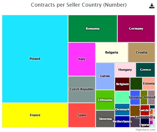
9. Tree Map Component:
The tree map component displays each point of data as a rectange. Each rectangle's size represents the size of its value relative to the other data points. This component also has drill-down functionality for data with multiple levels.
Example Usage:
<yds-tree-map
    project-id="none"
    view-type="contract.seller.countries.all"
    element-h="460">
</yds-tree-map>
Input Values:
| Input | Description |
|---|---|
| project-id (required) | String attribute, which defines the unique identifier of the resource that the displayed data is associated with. If empty, the element cannot be initialized. |
| view-type | String attribute that defines the declarative name of the table which contains the data to be rendered. Default value is "default". |
| lang | Language of the visualised data. |
| extra-params | Object with extra parameters to send in the request to the API. |
| exporting | Enable or disable exporting of the chart. (Default: true) |
| element-h | Height of the component, in pixels. |
| title-size | Numeric attribute, which defines the size of the chart's title. (Default: 18) |
| add-to-basket | Boolean attribute, which enables or disables the "Add to Basket" functionality. |
| embeddable | Boolean attribute, which defines if the component can be embedded or not. Available options: true, false Default: false |
| popover-pos | Attribute which defines from which side of the embed button, the embed information window will appear. Available options: right, left, top, bottom Default: right |
| enable-rating | Enable rating buttons for this component. |
| disable-explanation | Disable the chart query explanation button for this component. |
Screenshot: